Microsoft PowerPoint 2016 Level 1.7: Adding Charts to Your Presentation
$5.95
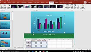
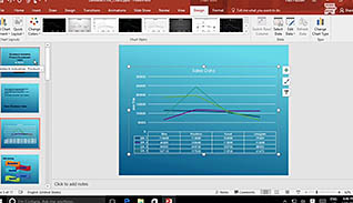
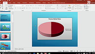
Presenting your data with an eye-catching chart will take your PowerPoint presentation to the next level. Having an easy way to display data visually helps your audience stay engaged and understand your data more easily. This course demonstrates the steps to create and format charts within PowerPoint 2016. Users learn how to use common formatting features to make charts visually pleasing. The last part of this presentation teaches users how to insert charts from Microsoft Excel, which is convenient, considering this is where most data is typically stored. Avoid creating wordy, text and number heavy slides by presenting your data visually with charts. Use this course to learn how to create more engaging presentations in PowerPoint 2016.
Description
Audience:
PowerPoint 2016 users
Workplaces:
Not Specified
Topics:
Introduction|Create a Chart|Format a Chart|Insert a Chart from Microsoft Excel
Languages:
en
Video Format:
HD
Quiz Questions:
6
Number of Lessons:
4
Training Time:
20-26 minutes
Closed Captioning:
Yes
Devices Supported:
Windows, Apple, Android, Chrome
Required Plugins:
None
Interactive Producer:
Mastery Training Content Network
Original Content Producer:
Sonic Performance Support GmbH