Microsoft Excel 2016 Level 3.5: Creating Sparklines and Mapping Data
$5.95
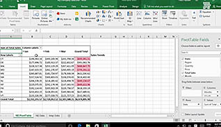
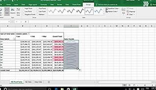
Sparklines help visually display data in a single cell, making it easier for people to quickly read data. Excel 2016 has a feature that allows you to plot geographic data on a map. This video training course is for employees to learn how to advance their Excel 2016 skills so they can present data is more visually appealing ways. This video teaches viewers step-by-step how to use the Sparklines tool to visually display data. Viewers also learn how to create 3D maps within their workbooks. Use this video to teach employees to present their data visually with Sparklines and data maps in Microsoft Excel 2016.
Description
Audience:
All employees who use Excel 2016
Workplaces:
Not Specified
Topics:
Create Sparklines|Map Data
Languages:
en
Video Format:
HD
Quiz Questions:
5
Number of Lessons:
2
Training Time:
9-14 minutes
Closed Captioning:
Yes
Devices Supported:
Windows, Apple, Android, Chrome
Required Plugins:
None
Interactive Producer:
Mastery Training Content Network
Original Content Producer:
Sonic Performance Support GmbH


